

DESIGN
At Purity, every detail has meaning, especially the colors we choose for our labels. They are not arbitrary. They are carefully selected to capture the essence of the spirit within, to reflect the soul of each expression, and to connect our craftsmanship with centuries of tradition. These hues are symbols of place, of process, of purpose — designed to evoke emotion and tell a story before the bottle is ever opened.
Why We Use Copper
At Purity, nothing is left to chance and certainly not the material that touches every drop of spirit we create. Copper isn’t a trend, and it’s not optional. It’s essential. It is the soul of our distillation process and one of the great secrets behind our unmatched true smoothness.
Our unique stills are carefully designed with copper surfaces at every critical point of contact. Why? Because copper is more than just beautiful — it’s a catalyst. It interacts with the spirit on a molecular level, binding with unwanted sulfur compounds and volatile impurities that would otherwise dull the flavor or introduce harshness. As the alcohol vapor rises, it meets copper again and again, purifying and refining each molecule until all that remains is depth, clarity, and softness.
This process doesn’t happen once or twice. It happens up to 51 times, through a multi-column, slow-distillation method that demands both patience and precision. Every copper contact point adds refinement, stripping away what’s unnecessary and elevating what’s essential: flavor, texture, and balance. The result is a spirit that doesn’t need to hide behind mixers, it’s clean enough to sip neat, and smooth enough to linger on the palate.
But copper’s role isn’t just technical. It’s symbolic. For centuries, copper has been the material of choice for master distillers, a hallmark of true craftsmanship. By honoring that tradition while pushing its potential further than anyone else, Purity stands apart. We don’t just use copper; we use it with purpose, passion, and precision at a level that no other vodka or gin dares to match.
This is the reason you can taste the difference in every bottle of Purity. It’s not marketing, it’s metallurgy. It’s chemistry. It’s art. And it’s a promise: that every drop we create is the purest possible expression of what a spirit can be.
The Colors of Purity

Purity Connoisseur 51 Reserve – Deep Black
Black is the ultimate expression of elegance, a color that doesn’t demand attention, but commands it. In the world of luxury, black represents discretion, power, and perfection. For our most refined spirit, distilled 51 times for exceptional smoothness and complexity, this color captures the mastery behind the process. It’s a deliberate choice: bold yet restrained, timeless yet modern. Like the spirit itself, it’s an experience of depth, structure, and sophistication, created for those who truly appreciate craftsmanship at the highest level.

Purity Signature 34 Edition – Royal Blue
This is not just any blue. It’s a royal blue rooted in Swedish history, the same rich tone used in the national flag before 1906. A forgotten color of nobility, now brought back to life. For our Signature 34 Edition, it represents a connection to our origins, our dedication to organic purity, and the contemporary refinement that defines our spirit. Distilled 34 times, it balances clarity with character, creating a vodka that is smooth, flavorful, and effortlessly versatile. The blue speaks of heritage, trust, and enduring quality, a modern classic in a color that feels both historic and fresh.

Purity Citron – White with Lemon Illustrations
Purity Citron is a celebration of clarity, in both flavor and design. That’s why the label is wrapped in a pure white background, the color of freshness, light, and natural purity. It sets the tone before the bottle is even opened, hinting at what awaits inside: brightness, vibrancy, and the unmistakable essence of organic lemon, captured with extraordinary finesse.
Adorning the white canvas are hand-drawn illustrations of lemons, not stylized graphics, but expressive botanical renderings that feel alive and tactile. They’re a visual cue to what defines this spirit: real fruit, real flavor, and a refreshing complexity that only organic ingredients can deliver. The lemons aren’t just decoration; they’re a signal. They tell the story of what we refuse to compromise on — no artificial flavors, no shortcuts, just real citrus layered onto our slow-distilled, ultra-smooth vodka base.
The choice of a white background isn’t just aesthetic. It reflects the character of the spirit: crisp, clean, and endlessly versatile. While many flavored vodkas are heavy-handed or overly sweet, Purity Citron is restrained and elegant. It’s bright without being sharp, smooth without being bland. The white label echoes this finesse, a minimalist backdrop for maximum purity, letting the ingredients and craft speak for themselves.
This design also marks a deliberate break from the cluttered, gimmick-driven world of flavored spirits. There’s no noise here, only nuance. The label is light, modern, and quietly luxurious, a perfect match for the organic spirit within. Whether you’re mixing a Citron Martini or sipping it over ice with a twist, the bottle tells you exactly what to expect: a clean, natural citrus experience with Purity’s signature smoothness at its core.
Purity Citron isn’t just a flavor extension. It’s a refined expression of nature, technique, and balance, dressed in white to let the lemons shine.

Purity London Dry Gin – Royal Green
The royal green that adorns our London Dry Gin is more than a nod to nature, it’s a tribute to the botanical complexity within. Coriander, thyme, basil, and juniper come together in a symphony of smooth, herbaceous flavor, and this deep, refined green echoes that harmony. Green has long symbolized life, renewal, and balance, all of which are present in this exceptionally smooth gin. It’s a color that feels fresh yet established, rooted in tradition but open to exploration. Just like the spirit it represents, it’s crisp, composed, and full of depth.

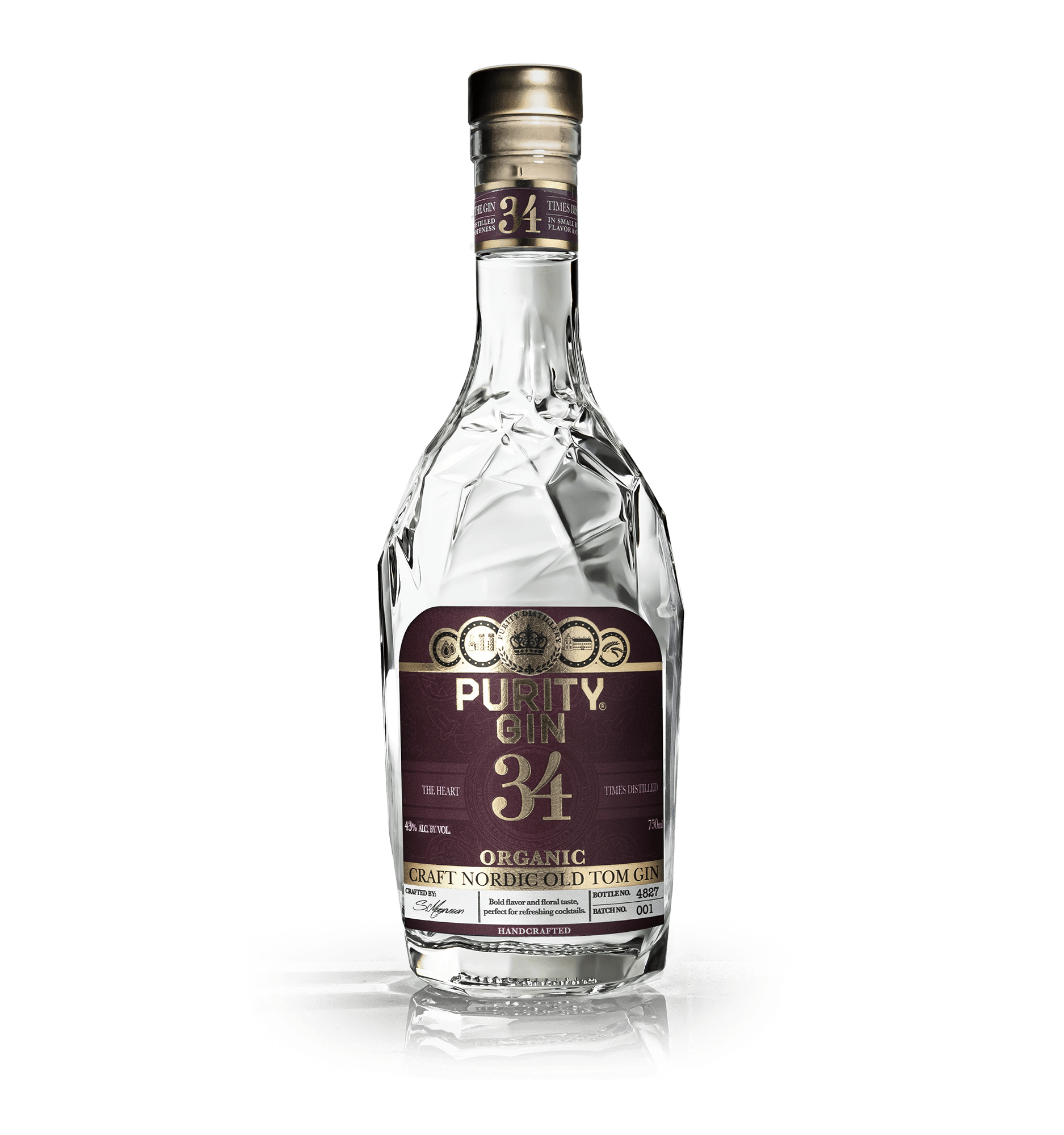
Purity Old Tom Gin – Royal Red
Royal red is the color of warmth, indulgence, and richness, all of which define the signature profile of our Old Tom Gin. This isn’t a sharp, spicy gin; it’s round, smooth, and slightly sweet, crafted to evoke comfort and complexity in equal measure. The red evokes old-world elegance with a touch of modern flair, capturing the romantic spirit of a gin style that once ruled London’s cocktail scene. It’s luxurious, inviting, and deeply satisfying, a label color that mirrors the generosity and richness of the gin itself.
Purity Navy Strength Gin – Naval Blue with Cross & the Royal ‘M’
This bold, deep blue background paired with a maritime cross is a direct nod to naval tradition, strength, and seafaring precision. It’s not just a label, it’s a signal. The “M” is taken from the Royal Navy signal alphabet, symbolizing both “Navy” and “Mathias,” our award-winning Master Blender, whose precision and creativity define every drop. At 57.1% ABV, this gin demands respect, but also rewards with an extraordinary smoothness that defies its strength. The color scheme honors both heritage and high performance, a true maritime salute, redefined through the lens of Purity.
