

TYPOGRAPHY
The Elegant Foundation of Purity’s Visual Identity
Purity’s typography reflects the perfect balance between sophistication and modernity. We use two primary fonts: Palatino Linotype and Helvetica Neue. Palatino Linotype conveys a sense of classic elegance and timeless luxury, perfectly aligning with our brand’s commitment to craftsmanship and refinement. It adds a formal touch, ideal for reinforcing our premium positioning. Helvetica Neue, on the other hand, brings a clean, modern feel that ensures clarity and approachability across all communications. Together, these fonts create a harmonious visual language that embodies the essence of Purity — luxurious, yet contemporary and accessible. Consistent use of these fonts helps reinforce our brand’s identity and ensures a cohesive experience across all touchpoints.

PRIMARY
SECONDARY
TYPEFACE
Our typeface choices, Palatino Linotype and Helvetica Neue, are integral to Purity’s visual identity. Palatino Linotype brings a sense of timeless elegance, while Helvetica Neue offers modern clarity and simplicity. Together, they balance luxury with readability, ensuring our brand communications are both refined and accessible.
A Blend of Elegance and Modernity

H E A D L I N E S A N D D I S P L A Y T E X T
E M P H A S I Z E C E R T A I N W O R D S O R S E N T E N C E S I N H E A D L I N E S A N D H E A D L I N E S P E R S O N A L Q U O T E S
Used for headlines and display texts. Can be combined with Palatino Linotype Bold Italic to emphasize specific words or phrases, drawing attention within headlines.
Palatino Linotype Regular

Palatino Linotype Bold Italic
Used to emphasize particular words or phrases in headlines, adding contrast and visual interest. Also used as an alternative headline style for personal quotes.
A L T . T O E M P H A S I Z E C E R T A I N W O R D S O R S E N T E N C E S I N H E A D L I N E S

An alternative for emphasizing specific words or sentences in headlines. Also suitable for primary headlines and display text in large formats to create greater visual impact.
Palatino Linotype Bold

S U B H E A D I N G A N D B O D Y F O R P E R S O N A L Q U O T E S
Used for headlines in personal quotes, offering a distinctive, softer, and more personal tone. It makes the content feel more approachable and less formal. If there is both a headline and body text, it’s preferable to use Palatino Linotype Bold Italic for the headline to create stronger contrast.
Palatino Linotype Italic

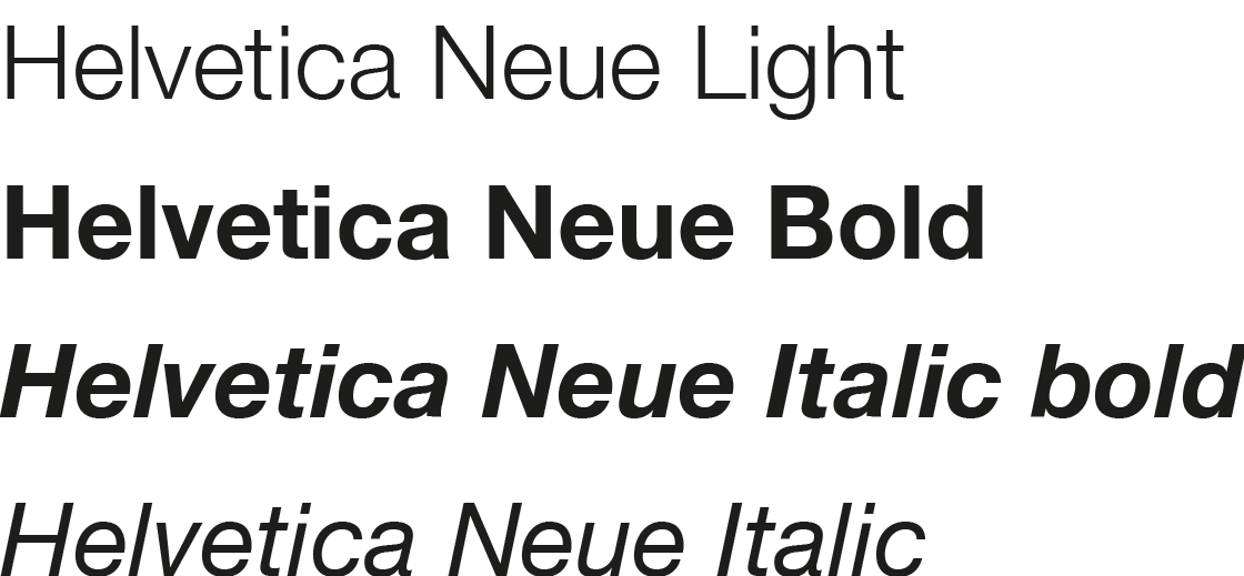
B O D Y A N D S M A L L E R T E X T
Used for general body text and smaller text, ensuring readability.
Helvetica Neue Regular
E M P H A S I Z E C E R T A I N W O R D S O R S E N T E N C E S A T S M A L L E R T E X T

Used to emphasize specific words or sentences in body text and smaller text, while maintaining readability.
Helvetica Neue Bold

H E A D L I N E F O R P E R S O N A L Q U O T E S A T S M A L L E R T E X T
Helvetica Neue Bold Italic
Used for headlines in personal quotes and for smaller text, ensuring readability. Also serves as an alternative for emphasizing specific words or sentences in body text.
S U B H E A D I N G A N D B O D Y F O R P E R S O N A L Q U O T E S - S M A L L E R T E X T

Helvetica Neue Italic
Used for personal quotes and smaller text, ensuring readability.
EXAMPLES
Ensuring Consistency and Excellence.
It is essential to follow Purity’s brand guidelines to maintain a consistent and cohesive visual identity across all platforms. Proper use of our typography, colors, and logos ensures that every interaction with the Purity brand reflects our commitment to luxury, craftsmanship, and quality. Consistency strengthens brand recognition and reinforces trust with our audience.

HEADLINE
HEADLINE AND SUBHEADING


ALTERNATIVE HEADLINE
HEADLINE, SUBHEADING AND BODY

SIGNATURES
A Seal of Expertise and Craftsmanship
The signatures of Master Blender Mathias Tonnesson and Master Distiller Stefan Magnusson are more than just autographs — they are the ultimate seal of craftsmanship, expertise, and dedication. Each signature represents decades of passion and mastery, ensuring that every bottle of Purity Vodka, Gin, and Citron meets the highest standards of excellence. These signatures are a testament to the meticulous care that goes into every drop, symbolizing the personal touch that defines the Purity brand. Prominently featured on our products, they serve as a mark of trust, authenticity, and an unwavering commitment to producing spirits of unparalleled smoothness and quality.

THE PROFILE PICTURE CAN BE IN COLOR OR BALCK AND WHITE.
EXAMPLE OF PERSONAL QUOTE INCLUDING SIGNATURE


Our logo package comes with both our logos in EPS, PNG and SVG format. Use EPS format for vectored scaling e.g. print and SVG for digital interfaces.